Friday, July 29, 2016

Today's Trompe L'Oeil Acrylic Painting - Recipe Card 3 - Butterballs a.k.a. Russian Tea Cakes

"Butterballs," acrylic on panel, 5" x 7"
Here is the third card in my mini-series of recipe card trompe l'oeil paintings. This original for this one is actually in my own handwriting. This was one of those recipes that I made with my mom when I was a kid, and continued to make for many holidays, as the powdered sugar always gave them such a festive, soft, beautiful look.

Thanks for visiting!

Thursday, July 28, 2016

Today's Trompe L'Oeil Painting - Well-loved Recipe Card 2 - Homemade Waffles


Today's painting in the well-loved recipe card mini series: "Homemade Waffles," acrylic on panel, 5"x7". And I did actually write out the note on the back of the panel because it would drive me crazy if I owned the piece and didn't know what the original note said. Spoiler alert: it's instructions for making sour milk.

Thanks for looking!

Wednesday, July 27, 2016

Just finished - Side by Side Trompe L'Oeil Painting - Buckeyes Peanut Butter Balls Recipe Card

"Buckeyes," acrylic on panel, 5" x 7".
Now that I'm back in the swing of Daily Painting, I thought I'd tackle a few short series of works. This is the first in my Well-Loved Recipe Cards series - Buckeyes. I remember making these as a kid - messy, and sugary, but super-tasty! All of the recipe cards I'll be doing were given to me when I got married, so each one's handwriting will be a bit different. This one was given to me by a friend who also wrote out the "Snickerdoodle" recipe card I painted a while back. I guess I really like her printing!

Thanks for looking!

Here's the side-by-side comparison of the original subject (left) and my painting.

Friday, July 22, 2016

Step by Step Acrylic Painting of Old Toy Matchbox and Hotwheel Cars

"Vintage Toy Car Collection," acrylic on panel, 8" x 8".  

A few weeks ago, my husband and I headed over to his mom's house and dug out his collection of small toy cars from the 1980s. I'd done a painting of some of his toy cars before, but not these babies! These were played with - hard. Still crusted with sand from the sandbox and rusted or dented on many edges, these are vintage with a capital "V." So of course I wanted to paint them.

When I did my other toy car painting, I used my acrylic-watercolor layering technique on Aquabord. For this piece, I decided to try a panel I'd bought from a local arts organization and covered with about six coats of sanded gesso. The difference, besides the handmade panel, is that the paint "floats" on the top when I do my layering technique, instead of sinking down into the panel. I used gloss medium mixed with dozens and dozens of layers of very thin transparent acrylic for this one, which creates a visual depth that I really like. It also simultaneously has a more painterly feel, with the brushstrokes from various layers still evident. In person, I feel like it carries the luminous look of a layered egg tempera painting - with light bouncing through the layers and back.

Here's some of my step-by-step photos of the piece. You can see I start very similar in method to the watercolor style, but again, each layer is basically a little bit of acrylic paint mixed with a lot of gloss medium. It was significantly more time consuming for me to work this way, but I think I'm headed in a direction I want to go with other paintings. Thanks for looking!

 1. With a basic drawing in place, I mix a "black" color from raw umber and payne's gray and begin laying out a monochromatic underpainting, trying to simply thin the paint to let the white of the board peek through.
 2. I need this stage to become a sufficient guide for me as I begin to add color, so I'm not trying to figure out too many complicated steps at one time.
 3. I prefer to lay out the "local colors" throughout the board rather than working on a single section. I find it's easier to keep my place and keep the painting more consistent as I build the layers to bring the entire painting up to the same level before moving on.
 4. Still building local colors.
 5. At this point, I've just started building the bulk of my layers. From here to the end of the painting, I spent roughly 20 hours. That's probably a little tough to see on the small screen, but it made a big difference in getting so many transparent layers and building a luminous painting.
 6. I work back and forth between glazing on the layers and sharpening the edges and details. I want to make sure, for example, that there are appropriate shadows, so the cars look like they are really laying on top of one another.
 7. Getting closer, but it was still probably 8 to 10 hours moving from this stage to the final one. It's little things, like the shapes on the hub caps or the rusty edges that make it unique.

8. And done! Thanks for looking!


Wednesday, July 20, 2016

Kit Kat Chocolate Candy Bar Acrylic Trompe L'Oeil Painting


"Kit Kat Emergency Stash," acrylic on panel, 10" x 8"/SOLD

I finished this painting a while ago and forgot to share it here. I haven't tackled a trompe l'oeil Kit Kat since I was painting in oil, about two years ago, so I wanted to give it a try in acrylic. This one was one of those trompe l'oeil pieces where just for a second I get fooled when I step back and look, so all in all I'm happy with it. Thanks for looking!

Tuesday, July 19, 2016

Chocolate Cookies Acrylic Painting Commission

I just thought I'd share a recent commission, "Chocolate Cookies," acrylic on aquabord, 12" x 16". I used a watercolor-acrylic style method for this one, so although I still used lots of thin layers as I normally would, the watercolor style helped me keep those blurry areas of the painting soft. That blurriness in this piece was a real challenge in itself because it's tough to get it to look convincing in a painting, even if the reference photo looks fine. Thanks for looking!

Friday, June 24, 2016

Step by Step Photos of Painting Strawberries in Acrylic

"Strawberries," acrylic on panel, 6" x 6".

When I first began painting a few years ago, I did an oil painting of strawberries in one of those plastic containers. While it turned out pretty good, it was one of the most frustrating experiences I had yet had in painting - strawberry paintings are not for the faint of heart. But this week, I picked up some organic strawberries that were just so lovely I couldn't avoid painting them.

I knew going in that this was going to be a pretty complicated piece, so I photographed many of my steps as I painted. I had to scour the Internet to find many of the techniques I've learned to use, often adapting oil painting methods to my acrylic process, so I am happy to share here with other artists who may be experiencing the same thing.
And this time - this painting took me about 10 hours, whereas the other strawberry painting took two to three times that. So hurray for that! Enjoy the photos! 

With a piece this complicated, I like to approach it the way one would a jigsaw puzzle - you don't just start; you first find the edge pieces and separate them and build a framework from which to begin. So that's how I'll do this, using a rough drawing and an underpainting in raw umber only. That way I can establish the shapes and values without confusing myself with color just yet.
I think I actually used this very small brush for the entire painting. If you're wondering, it's a 5/0 synthetic sable brush.

I'm working on an Aquabord panel from Ampersand, but sometimes I prefer Gessobord. The difference to me is that with the Aquabord, my paint layers absorb more readily, especially the lower layers, meaning I have less texture in my overall piece, which I prefer.

I use both water and matte medium to thin and spread the paint at this stage. I also go back in with a darker mix of raw umber and payne's gray in the darkest areas and bring out the white highlights, too.

As I begin to add the color, I work in very thin glazes, using straight matte medium most of the time, not water, because I want to build up a rich level of transparency, so the light moves through the layers of paint. This process requires quite a bit of patience, but it is, to me, able to create a far more accurate and pleasing result than I can get with direct painting in acrylics. 
If I remember correctly, the only colors I used in glazing the strawberries were napathol red, cadmium yellow, cadmium orange and ultramarine blue. Purer colors strategically layered over one another to create optical colors helps to create the luminosity I'm looking for. I also don't want to dull the colors with white, so I'm trying to make the white of the background work for me, and get color intensity by lots of layers.
The key here is to not get lazy. Work back and forth to keep refining details and shapes and colors in relationship to one another. Some artists can work more systematically, like in a grid. While I've used a grid on occasion, I really find that I need to be looking at the entire piece, jumping around constantly, to get it to all work together.

My berries are finished at this point. I've gone in a refined the highlights, added lots of glazes and made sure my seeds are more convincing.

Stems are done and so is the piece! It was a great exercise in proving to myself that even a complex subject can become possible when you have patience and follow a good process. Thanks for looking!


Wednesday, June 15, 2016

Trio of Candy Bar Acrylic Paintings in Shadowbox Frames

I recently finished a trio of 8" x 8" chocolate candy bar paintings on 1/8" thick panel for a client. She then asked the dreaded question, "Any framing suggestions?" I'll be honest, I have little to no idea about how to frame my pieces, which is something I definitely need to remedy. My usual response is  that any frame will do - just pop the glass out so the paint doesn't touch it. But I've also had a few other clients recently tell me that they have framed my pieces in shadowbox-style frames, where the painting sits back a bit from the glass. They said it makes them look more three-dimensional, so I shared that recommendation with this client. She liked it, and was kind enough to send me photos of the pieces, framed in shadowboxes and hung together, to share with others wondering what to do. So while this isn't a definitive suggestion, it's definitely a pretty lovely option. Thanks for looking!


Monday, June 13, 2016

Wednesday, March 30, 2016

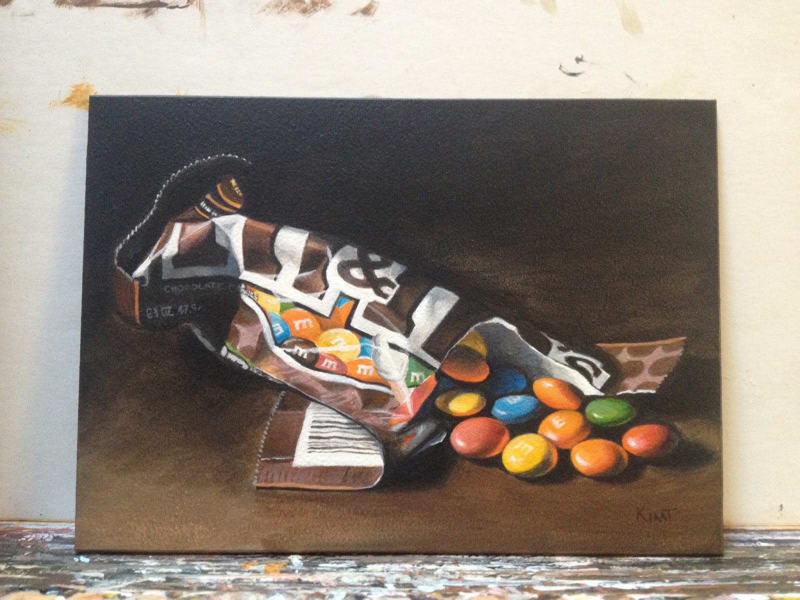
Step by Step Painting of M and M's Chocolate Candy Bag - Acrylic as a Watercolor Alternative

"Dramatic M & M's," acrylic on panel, 5" x 7"

It's been a while since I posted a step-by-step piece, mostly because I get so into the painting process I forget to photograph my steps. But I've been painting more and more pieces in acrylic using more of a watercolor painting style and thought I'd share my latest piece. Yes, you can water acrylic paint down to the consistency of watercolor as long as you follow a couple of simple rules - 1. paint on a watercolor surface (I prefer Ampersand Aquabord) and 2. seal the painting with non-diluted acrylic medium or varnish at the end, to ensure proper adherance.

Why not just use watercolor? For me, using acrylic like this has many advantages, including the ability to paint more opaquely when needed and keep layering without worrying about previous layers being lifted (you still have to wait till the layers dry, but it doesn't take very long). Yet I still get the softness of watercolor on my edges if I want them, and I don't have to worry about the workability of the acrylic paint, like the dreaded "tacking up" feel of acrylic in the drying process.

If you are interested in exploring this style of painting after reviewing the step-by-step photos below, I recommend the book "Acrylics The Watercolor Alternative" by Charles Harrington, which really opened my eyes to the flexibility of watering down acrylic paints. Enjoy!

 1. I start most of my paintings with a basic outline of the main shapes and an underpainting mapping out the darks. I always mix my blacks, which makes for more richness and less of a flat feeling. For this piece, my "black" is mixed from Ultramarine Blue and Raw Umber.
2. It's easy to rush past this step and head straight for the color, but it makes things far easier and faster later if you get the dark shapes pretty clearly established first.
3. I always use a pretty limited palette. To begin establishing my "brownish" colors, I used Raw Umber tinted with various amounts of Napathol Red, Cadmium Orange, Cadmium Yellow or Ultramarine Blue. I do sparingly mix titanium white in at this stage if needed (like on the package), but I try to minimize its necessity.

 4. Again, it's easy to rush through this before moving on to the brighter areas of the painting, but it's best to take your time and get it right, building from dark to light throughout the painting. I can still fix some of it later if needed, but I try to get it right in most areas early on.
5. Adding bits of color and continuing to refine the surrounding areas.

6. In total, this piece took about 8 hours to complete. Thanks for looking!


Tuesday, March 29, 2016

Colorful Crayon Pile 2 - Daily Acrylic Realism Painting

"Colorful Crayon Pile 2," acrylic on panel with heavy gloss varnish, 6 inches x 6 inches/SOLD
I painted a pile of crayons a few months ago and thought it was such a fun piece that I did another, this time featuring primarily pinks, blues and purples. I also strayed from my norm a bit and applied several heavy coats of varnish, resulting in a slick glass-line sheen for piece.

Thanks for looking!


What's New

My Blog is Moving to MakingHappyArt.com

Hey all, just a quick post today. I've neglected my blog for a long time. Part of that was because the functionality on Blogger is just ...